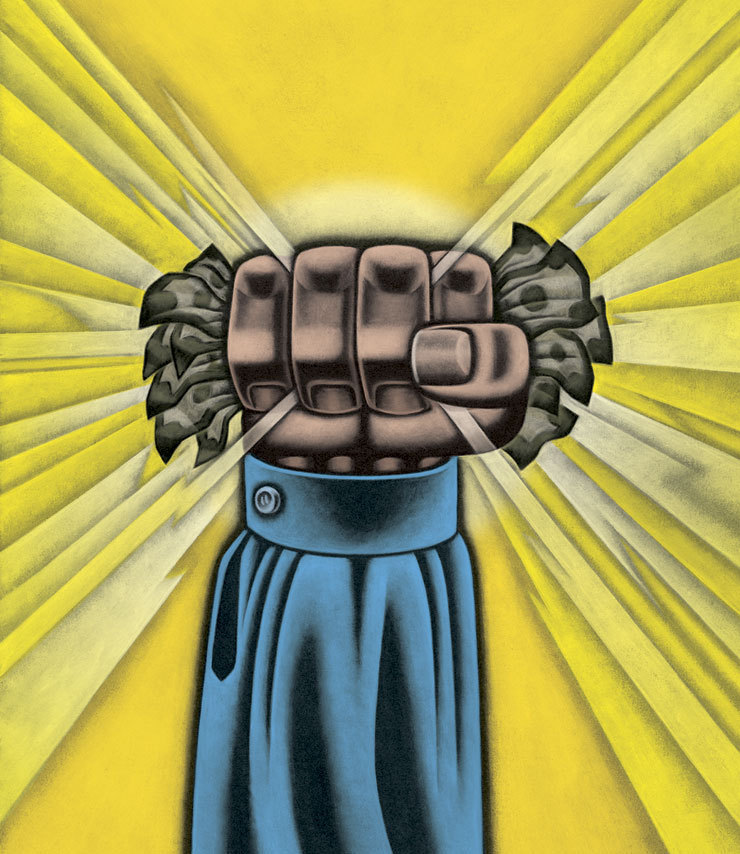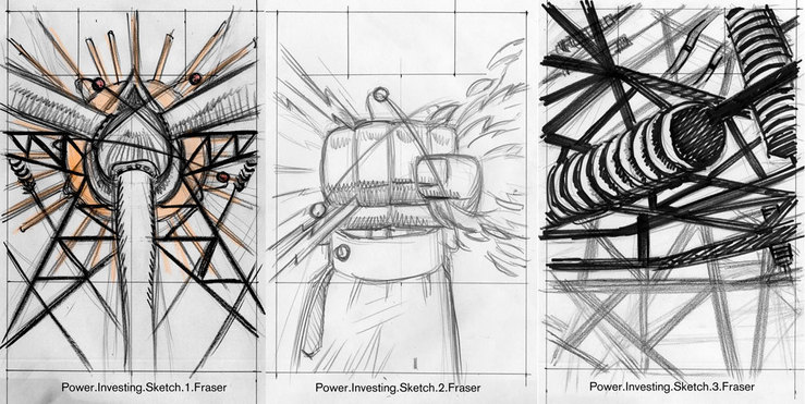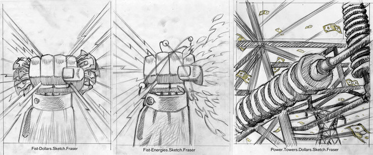
Over the last few years the symbolism of a hand has stood in for that of a figure in my work. In quite a few of my recent assignments the need to indicate an individual can be fraught with questions of nationality, race, and others. For many years I developed a figure with a generic structure purposefully. There was, and have been questions when I worked of making sure that the figure was not too "scary". Use of shadows, and usually requested powerful figures made some clients uncomfortable even though it was that very quality that had them calling on me. After working through many sketches, the simplicity of the hand as a representation of a group with the fingers, or just a lone individual, and many of the nagging questions went away. I do enjoy working with the figure still, but … well in many cases it's ended up being a hand. This last week it was a hand for the Wall Street Journal. An article on investing in power & utilities, and the editors wanted POWER. It was the art director, Orlie Kraus who called. Hell we even talked on the phone! Not just email, and text. Well Orlie & I worked hard to offer the editors(word people) solid choices. The first round of my sketches were sent, and well so it went. The Hand was the editor's pick. Next was the request for "Show Me The Money", dollar sign, and dollars added. With the second round, Orlie tried to offer our favourite of the utility towers for reconsideration. Nope, it was POWER that was wanted, and the hand was waved through. I went at the hand to make it as powerful as requested!

First round sketches.

Second round sketches.

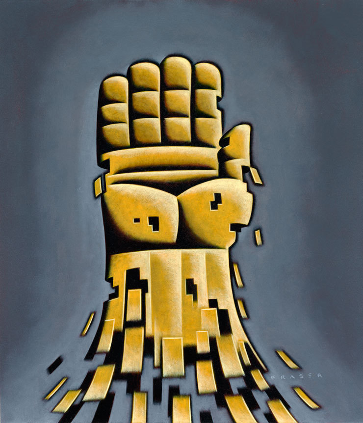
Another recently published hand based illustration done for the National Federation of Labor. Subject; Organize The Unorganized!