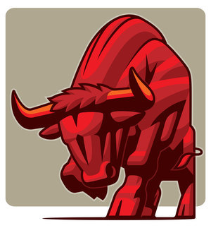
sample of mine for direction preferred by the art director.
It was a smaller illustration, not a full page, but it kept me redoing sketches. An illustration for Runners World, which I thought was going one direction went another. The same subject with a different spin seems to be the challenge with this part of the magazine. At least that is my take on it. The subject is of a runner, in this case highlighting training for strength. The art director, Marc Kauffman, wanted a graphic(not painted) approach. He had picked an image I had done before as a guide to what might work. It was a vector piece from my website. Well I ended up going with more of my brush and ink approach. Here's the sketches, and final. In the end patience, and perseverance, we got there.
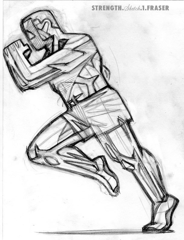
"Strong like Bull"
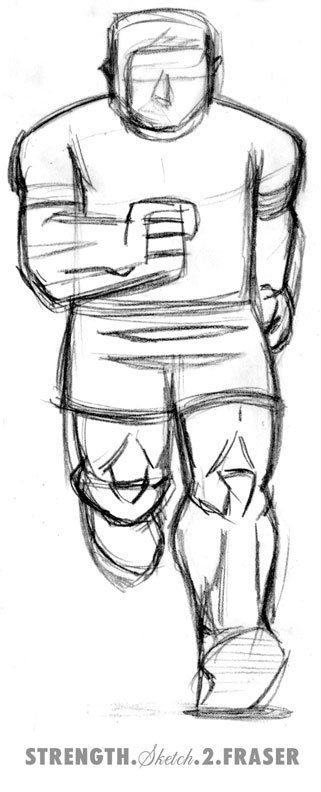
no banana - too much beef
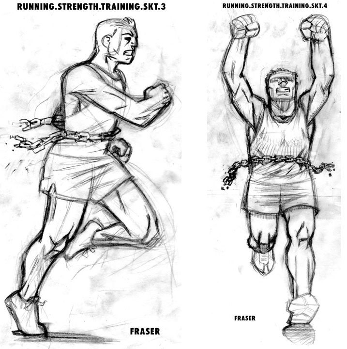
Picks #4, but wants a different face.
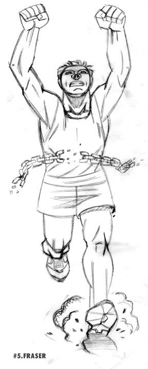
Face is too round, also alter the chain for the text to flow around.
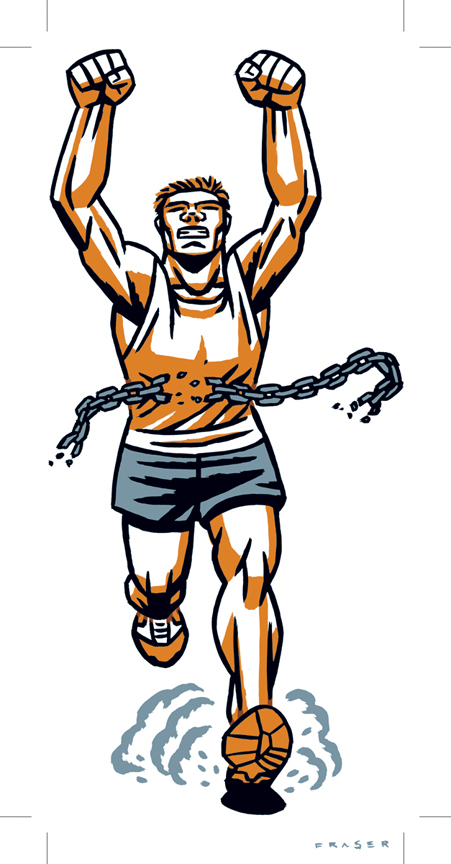
Finally the finish!