Summer Mixer

Small Big
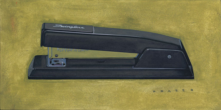
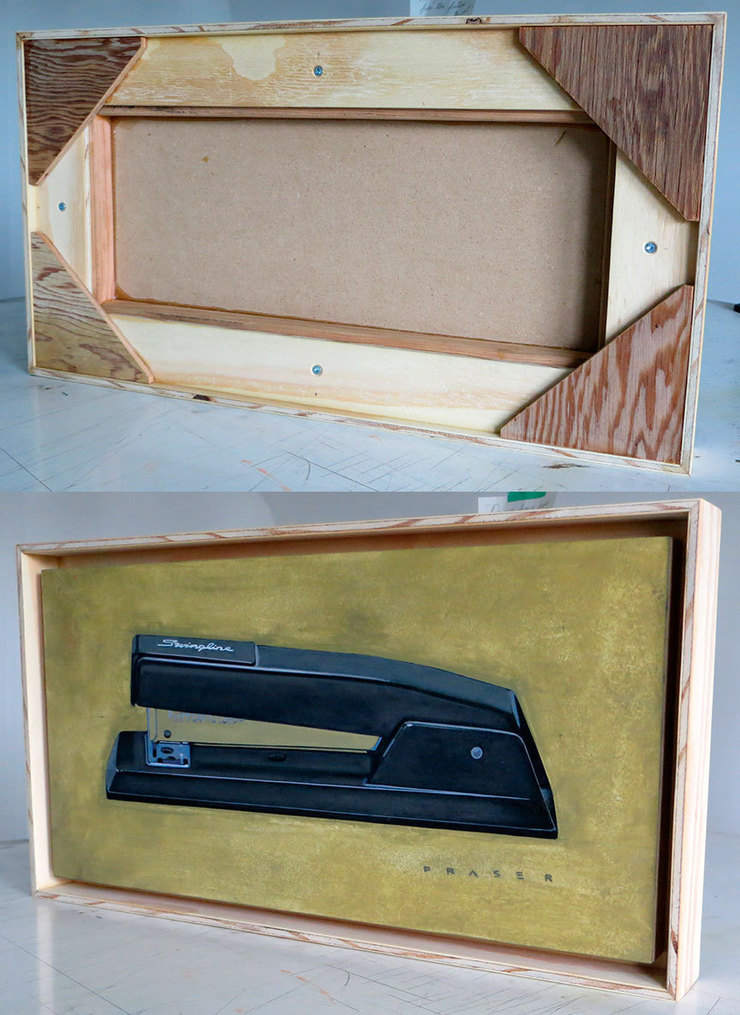
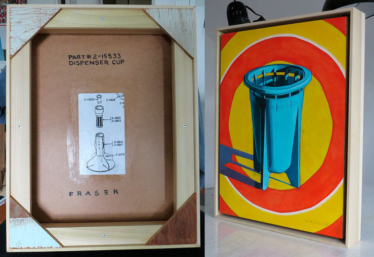
I've been exploring my own framing the last few years. I see some very interesting history on the backside of framed pieces of artwork in galleries. The handmade craftsmanship that went into some of the older pieces has been inspirational for me to take my own thoughts into framing my own work. It's an extention of my interest and thoughts about materials. Also frames have provided a bit of protection from the enviteable shuffling of paintings in a gallery setting. Kind of a merging of a subtle intention of the artist in materials, presentation, and practicality.

And on another note;
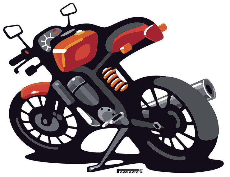
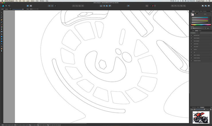
I do really enjoy working with vector based graphics. My old Mac was eight years and could not be upgraded. Thank you Apple. So after recently updating the OS on my new refurbished computer, I had to deal with the inevitable fallout of solid running hardware(Scanner, printers, tablet, optical drive, monitor…) being turned into landfill by software “upgradesâ€. It was a lot of work, and frustration, but it’s all hanging together. I do not enjoy pouring my funds into a computer. They hold their value like a bucket full of holes. I’m running the latest OS now, but I had to do a lot of research to keep my version of Adobe CS6 running. With Adobe moving backwards to a 19th century feudal payment system where workers no longer own their work. Like serfs working the land for the lord(corporation). Never mind the sales pitching from their website(how great the new CC is…blah blah), and being squeezed with updates into a forced obsolescence. So I recently took the step and purchased new Affinity software(Photo & Designer). It’s been a learning curve, but I’m really starting to enjoy some of the new attributes of what I see with their offering. Not to mention a MUCH more rational cost of ownership. That’s right you own your own copy. Still lots to learn though.
Â
Lordy! it's Stanley
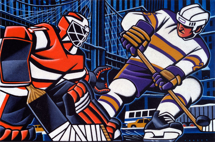
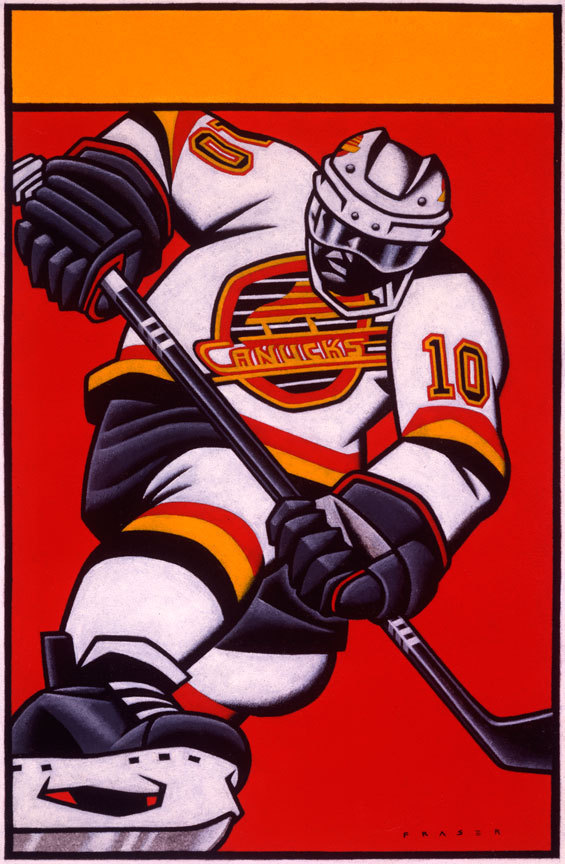
Well it's that time of the year when the north half of North America(Canada, and some parts of "the States") gets a little crazy. Or at least in those areas that are still in the hunt for Lord Stanley's trophy. Yes, It's The Stanley Cup Playoffs! The pucks been dropped, and the battles are underway. I'm climbing on the Vancouver Canucks band wagon after kicking around the west coast of Canada for over a decade. In the Canucks - Black Hawks(Chicago) series, Vancouver leads three games to zero. All up & down the west coast of British Columbia, and even into the surrounding areas, more, and more are daring to believe. The Stanley Cup playoffs are a gruelling, punishing, trial for any of the NHL teams. Cold beer & chips, gimme the remote, oh god it can be painful to believe.

100 Heads for Haiti
One more post for the show & sale of - 100 Heads for Haiti
Once again, my contribution to the Haiti benefit show "100 Heads for Haiti" that Dave Plunkert at SPUR Design has organized to benefit Doctors Without Borders
GOAL: $10,000
Original Art and a Group Poster print will be sold at the gallery, pieces will be sold on a first come, first serve basis. The remaining pieces & posters that do not sell at the gallery event will be available for purchase online for one month after the opening.
Original Art: $100 (plus tax) Two piece maximum per customer.
Group Poster: $50 (plus tax)

Comixology

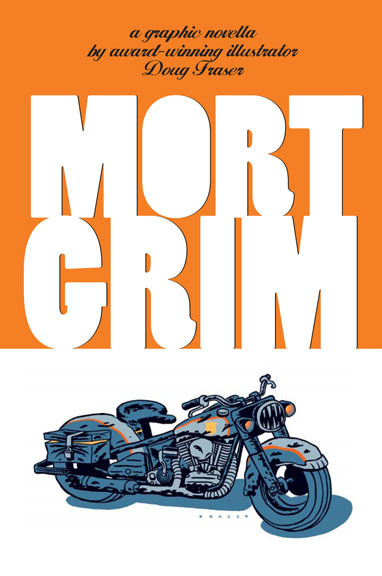
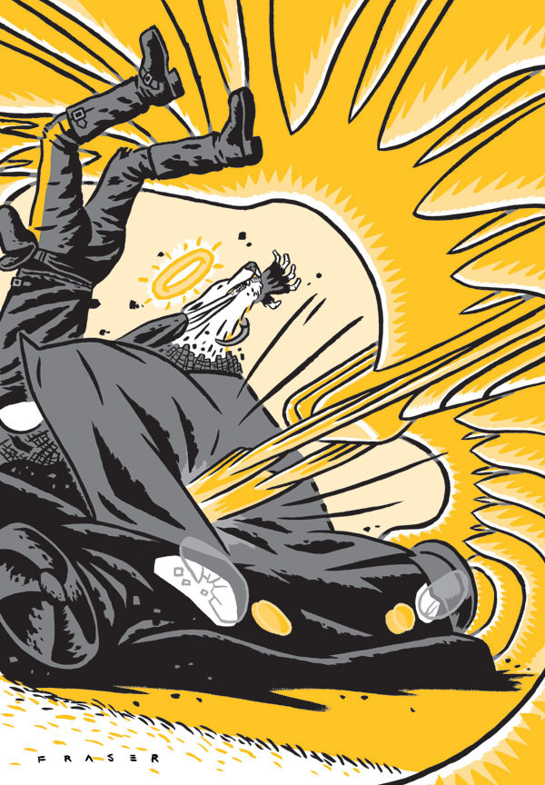
Awhile back I did my own little comic book. Chris Pitzer of Adhouse press published my thirty-two page graphic poem. I loved working on it, and exploring the process. Chris was and is very supportive. He's a huge fan of comics and producer of some gorgeous books. Adhouse Publishing is now offering several of it's titles for enjoying in a whole new way. Comixology is where you can get a digital copy of many comics.
on facebook http://apps.facebook.com/comixology
on iPhone http://www.comixology.com/iphoneapp
Ahouse Books site http://www.adhousebooks.com
Harry & I
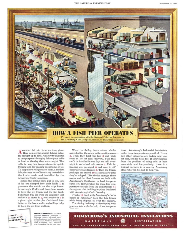
After seeing Mr.Campbell's wonderful fresh diagrams, I sent him links about this past master. Harry suggested I post the links. So from Leif Peng's great blog about awesome classic illustration, here's some past diagram nervana, enjoy;
http://www.flickr.com/photos/leifpeng/432727691/in/set-72157600024625909/
http://todaysinspiration.blogspot.com/2009/05/frank-soltesz-remembered.html
Summer Memory
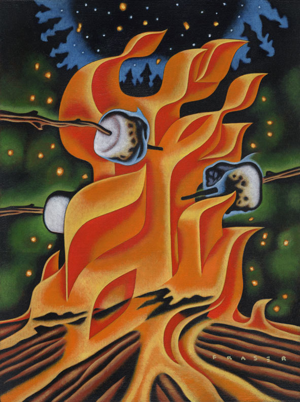
Fun piece for a themed group show in Calgary, CANADA. The title of the show is Bonfires. It's at the Uppercase gallery. The painting is oils on wooden panel, 9 by 12 inches.
'65 Pan
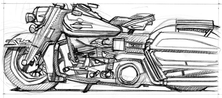
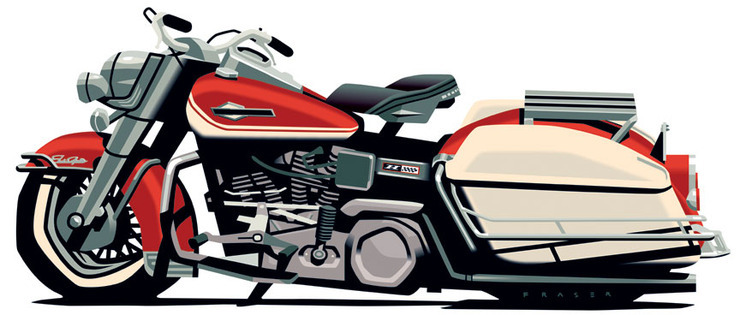
Many other manufactures have tried to copy the line it laid down, and not been seen to do so. I've looked closely at the copies, and see the many plastic parts that stand in for the metal of the original. I'm not a chopper fan, no obnoxious pipes please, just an original used, but not abused classic. It's not the only bike I care to own, just one of a hundred. The name alone is a theme, Electra Glide.
Right Practices

Interesting timely YouTube video in regards to the Google thing; http://www.youtube.com/watch?v=mj5IV23g-fE
Farewell Pontiac
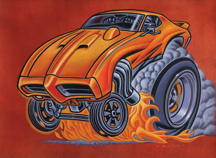
Follow-up to Carl's post. Ole' Goats are passing by as GM says good-bye to Pontiac. I did own a '68 GTO years ago. I know their time has past, but the memories are real. I couldn't add the cool Judge logo in this illustration for copyright reasons. The cars that sport the Pontiac logo today just leave my jaw on the ground in disblief.
Slugger

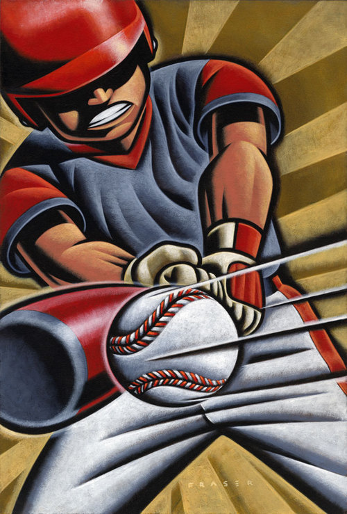
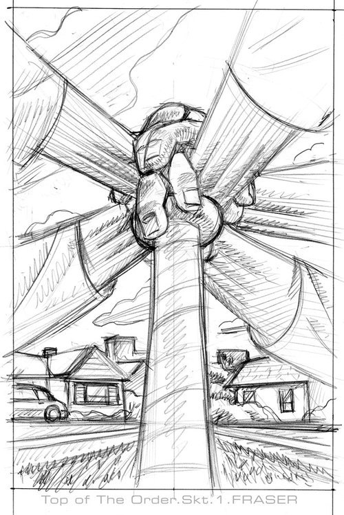
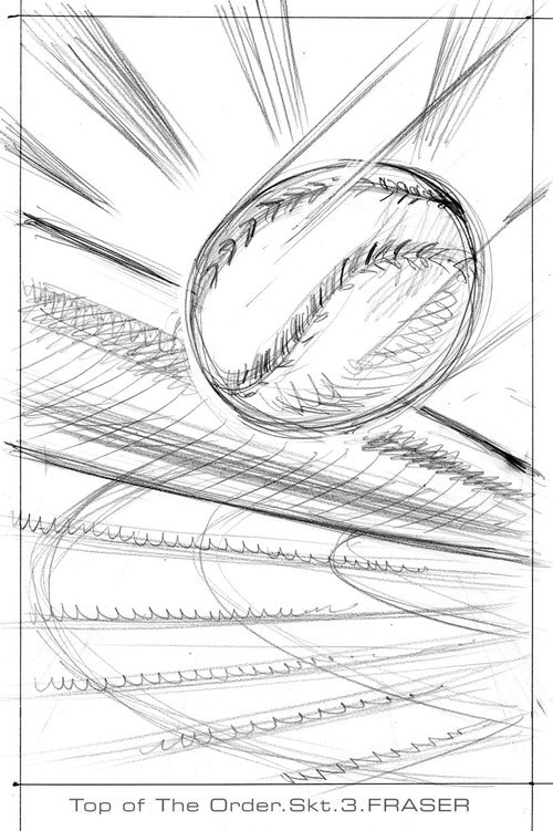
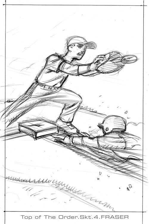
Well I did a young adult book cover my first. It's as close as I've done to a children's book in my life lately. I did do David & Goliath years ago. The art director, Rich Deas, ran me some. He's a good guy, but I was starting to..... well here's the sketches, and final. The story is about a gang of contemporary youths centered around their urban/suburban struggles, and the baseball team they form. The publisher and art director wanted art that would get the boys reading. The title is,"Top of the Order", and it's to be one of a series. The author is John Coy. He has written quite a few youth books.

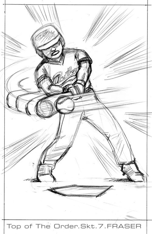

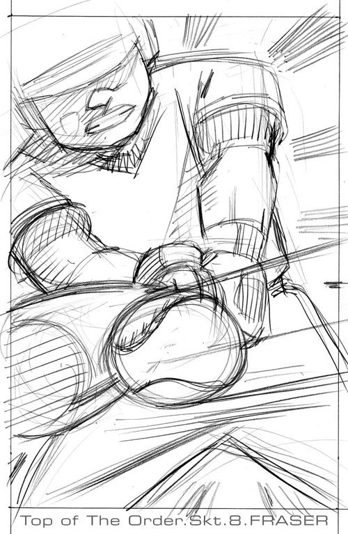
Adolescent Tendencies
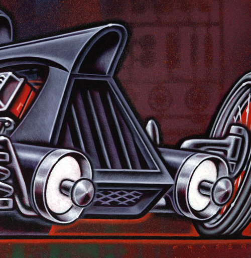
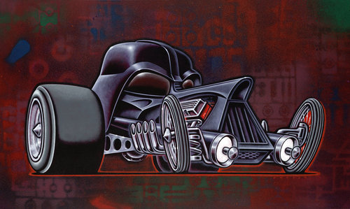
I've mentioned the subject of adolescent tendencies. Here's something I did for a as yet "undisclosed Lucasfilm project." I checked with the organizer of the project, he said it would be okay to post. It was fun to play with the subject that had such impact in my mind when the first film came out. The title of the piece is "1/24th Scale".
Roll 2009

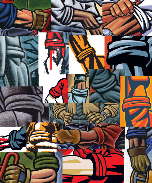
Well it's a New Year! Roll up those sleeves. There has been a few constants in the subject matter I've dealt with. One being the rolled up sleeve. A rolled up sleeve usually arrives when fashion takes a backseat to getting down to work. Of course there is the image of a politician with rolled up sleeves, and then we're back to empty fashion. A car sales person rolling up their sleeves , and telling you how " They're goin' ta help ya' "usually means you're going to be bowl-legged in the end. A Customs Officer rolling sleeves is not a good thing either. One can roll up your sleeves consciously, and neatly. There is also the more rushed and less groomed approach. The rolling of sleeves to the mid fore arm is more a management thing. Rolling up to the elbow, or more is real work. The end result is usually a statement about a tone of candor. The rolled up sleeve on different individuals says something unique in it's own way. What the person is wearing, and the back drop is very important in the overall visual statement. A white collar worker rolling sleeves up can feel more staged than a blue collar worker. Then there's the "collar" as subject for another time. The main point is it's 2009! Roll up those sleeves.
