Douglas Fraser

2008

Back to the Future

OCTOBER 24, 2008

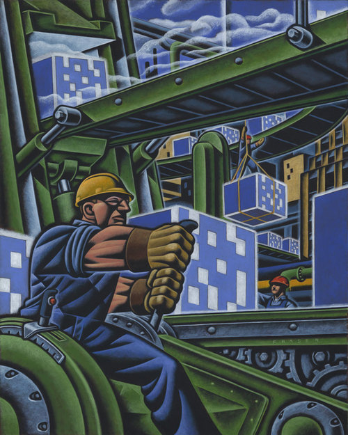
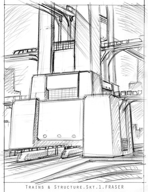
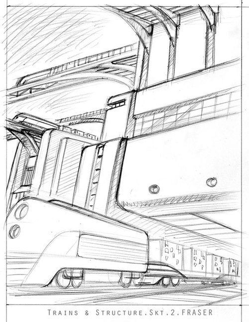
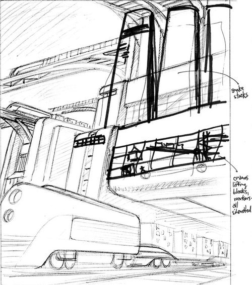
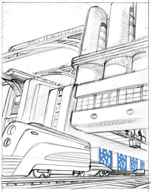
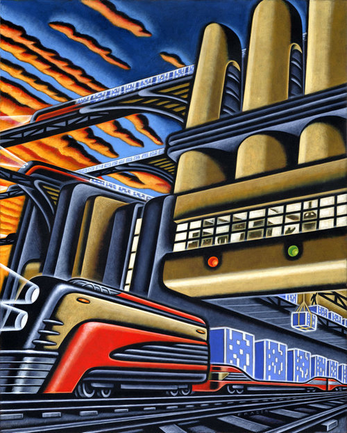
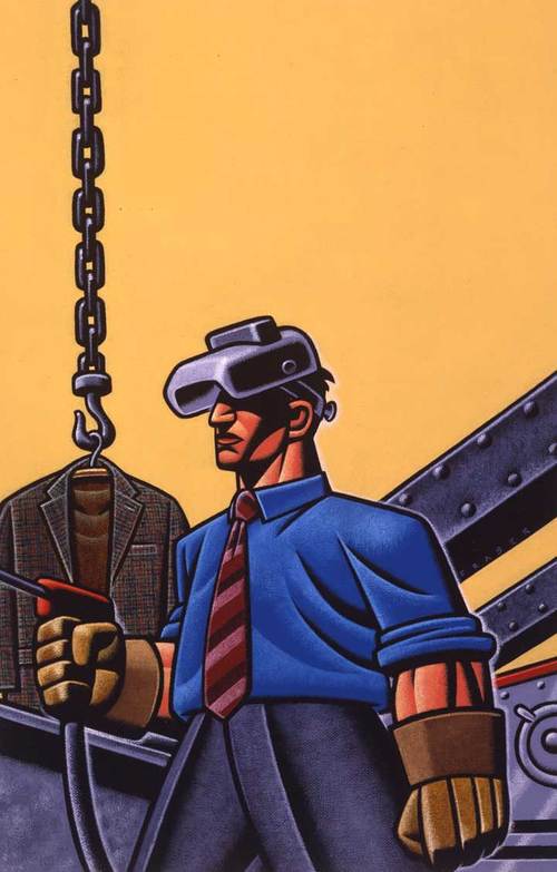
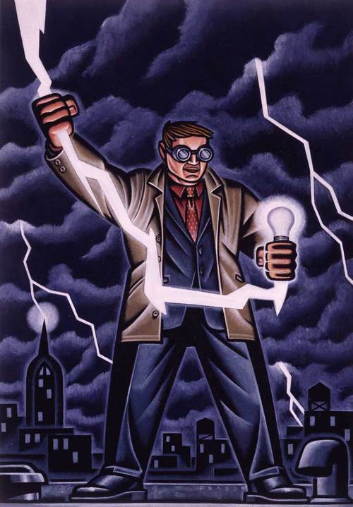
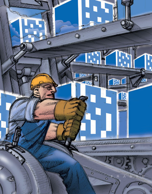
It's back to the future for me on several illustrations for a client known as Digital Realty Trust. DRT builds data centers, we're talking massive secure places that are built to hold large amounts of data for corporations, and industry. The art director, Benji Vega, wanted a strong powerful industrialization-of-America look. Here are the first two of three illustrations highlighting DRT's logo in the art. The first illustration is from the factory. A worker throws a lever in the foreground with the cubes rolling out for distribution. In the second the cubes are leaving the factory and being shipped out on a trains heading in all directions. I went for a 30's era streamlined look to tie with mural theme. Hugh Ferriss meets Buck Rogers. It's subject matter I've dealt with before. That era of murals, and dreams seems to symbolize the feeling of a better world through technology. Here some pencils and the first two illustrations.

First rough.That's DRT's logo cube coming out of a press machine. Also I don't usually do color roughs.

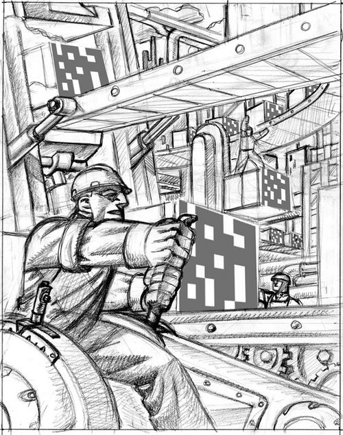
After some revisions the under drawing for final art was approved.

First Illustration - Worker & Factory
One of two rough sketches for the second illustration.
Second rough sketch.
The art director wanted some kind of smoke stacks added. Plus a sunset.
I designed smoke stacks, and kept them heavily filtered. No smoke.
The second illustration with sunset. Number three was just finished, but not published yet.
permalink | comment
Topical: Advertising  

Nuclear Pies

SEPTEMBER 30, 2008

Just hitting the newsstand in Alberta, Canada is the most recent issue of Alberta Views Magazine. Alberta, for those that don't know is north of Montana, on the east side of the Rockies. Oil, and ranching are big in this Canadian Province. There is a ironic issue being pounded out in Alberta surrounding the question of nuclear power. Alberta is home to one of the largest oil deposits in the world, yet is being pressured by the nuclear industry to build a reactor in the north part of the province. The article I did illustrations for seemed well written and detailed. The Nuclear industry will always frame the question in an either-or manner, to achieve the prescribed answer. The discussion of Renewables, and their future development, and growing strength is quickly dismissed by the Nuclear factions. Also real bottom line numbers on the cost of Nuclear is never shown in the light of day. The term "Bullshit" is in the text, and backed up. The opening illustration is obvious in subject, with the half page image follow-up being the Renewables, wind & solar. So I've now painted crap, to the affirmation of some.

Opener art
Half page - The Renewables, Wind & Solar
permalink | comment
Topical: Editorial  

Labor

SEPTEMBER 18, 2008

Back on Labor day, September first, the National Labor Federation released it's 2009 calender. I was asked to paint an image for the month of June. The subject is migrant workers in the agribusiness workplace, and the beginning of summer employment. I wanted my illustration to be bright, optimistic, and respectful of these workers. The calender project is to draw attention and support for some of the lowest paying jobs being done. It does seem like a never ending struggle for the dignity of workers. Workers who travel farm to farm during the growing seasons, and harvest. Also included is a past painting done for the National Labor Federation.

Art for the month June 2009
Art for "Dare to Struggle, Dare to Win in the New Millennium" National Labor Federation 2000
permalink | comment
Topical: Advertising  

Something in Summer

AUGUST 14, 2008
Summer is not long enough here in the north. On the newsstands now the September issue of Mens Health, I've an illustration. The subject was a list of 15 must see things. The subject matter was very wide which made it quite difficult to narrow down to show all fifteen items. I guess a two page spread might have worked.  The text is a list of  fifteen must-see-items in a bullet format. The list of items were to get the "Contemporary Male" off his electronic gizmos, and into the real world. Some of the list includes; Open heart surgery, the grand canyon from the air, a Mark Rothko painting, a local dump/landfill, a desert flower bloom.....and more. Each item was a couple of sentences. Maybe it should have been a picture book for the contemporary humans....hmmmm. Oh well difficult to cram into three quarters of a page. In my first two sketches I just tried to convey a feeling of breaking free. In my third sketch, was a feeling of being awe struck, and blown away. I included a cell phone to represent the electronic gizmos. With the background being the shredding of the "Contemporary Male's" world. The art director, John Dixon, wanted a graphic look. Fine, so I worked with brush & ink, and hand separations keeping a graphic feel with a hand done execution. I gotta get back outside.
permalink | comment
Topical: Editorial  

Diesel Evo

JULY 1, 2008
Andy Foster is the art director at Motor Trend magazine. I've worked with Andy on a number of assignments.  Most of the images in automotive magazines are photography. I enjoy the freedom to use different media approaches when I feel they better suited the assignment. Also I enjoy contrasting the approach with the subject. Instead of the harder edged approach of vector I wanted to add a human quality to the mechanical subject matter. Andy called with a spread illustration for the evolution of the diesel. I was directed to include certain vehicle models from the past. The present day diesels are very different than their truck based ancestors. I did offer different approaches in the sketch phase, but the feeling went to the evolutionary steps. I still think the "Dinosaur" #3 sketch could have been fun. Still the challenge of resolving the morphing from one model into the next, and dealing with the old gutter ending up being my main hurdle. The illustration is on the newsstand now, but of course a few months back when I did this assignment the pain at the pump was mounting. Diesel prices are tracking gasoline, maybe the bicycle should have been the last stage on the right?
Left side
Gutter
Right side
Spread
permalink | comment
Topical: Editorial  

Iraq + Film

JUNE 25, 2008
I've been doing a mix of assignments lately. Some editorial, and some advertising. With the current economic picture coming daily at me through the media it does feel good to be working. In the most recent issue of Mother Jones, the section Media Jones, I've done an illustration. The subject being the Iraq war film, and the failures to date. Hollywood has not produced a project that has connected with the American public. In my opinion it might just be too early historically to have perspective on the subject. Attached are my sketches and the final art. I wanted to try and describe the disconnect between war & Hollywood, plus a pathos in the lone over burdened soldier. The soldier is isolated and alone. For final art my art director, Allison Milmoe requested an approach I've done with brush & ink, and my computer. It's old school hand separations. It felt good to have worked with Mother Jones after quite some time since I last did.
permalink | comment
Topical: Editorial  

Stang Stung

MAY 16, 2008
I did a FORD canada assignment a couple of months back, that just now is being seen. I think it was the art I had done for Pep boys that drew attention to my working on the project. The original call came in last November, and hoped it would be fun. The project involved assigning a model in the FORD line-up to a different artist. The Mustang was the model I was assigned. I was quite excited as it was a car dreamt of at an earlier age. Just before starting sketches, FORD and the design firm decided to DROP the car, and have the artists painting a backdrop to have a photo of the car stripped in. The fun assignment seem to loose it's drive for me. I received a sample of the color the now none existent Mustang was to be as a guide for my illustration. The color was a silver gray, which is to say "gray". I tried to develop a feel in the image that described the Mustang. The painting was done in black & white with the color sample used for the foreground of the image. I used two other colors for the rest of the image. Color added digitally.
Final Art - Mustang oops! no car
permalink | comment
Topical: Advertising  

Honda Hoot

FEBRUARY 22, 2008
Was away for a couple weeks. An assignment I did back in December is now coming out in some magazines. Over the holidays I was busy on an assignment for Honda motorcycles. Motorcycles have been an interest for me for many years. I got on my first motorcycle at thirteen. It's was a Honda CB100. So when I get a chance to do some illustration work with a motorcycle it's a pretty good deal. I've done work for motorcycle magazines over the years, but the advertising work usually is photo based these days. The last advertising work I did was back in 1993 for Suzuki. This assignment was to be "friendly" as Honda wanted an inclusive message, not just one tribal group as in outlaw biker, or racer bad boys. Attached are the development sketches. Earlier on the direction was to include a dragon theme which came from the venue in Tennessee. The area in Tennessee has twisty roads that are fun to ride on a motorcycle, named the Dragon's Tail. I've added the old Suzuki illustrations for comparison. The Suzuki pieces are fifteen years old now. I was really inspired by the work of Stuart Davis then. I wanted the Honda image to have more of an americana regionalist feel. So here's what follows;
Sketch.1
Sketch.2
Direction picked by the client.
Dragon dropped by client
Finished illustration
Old work for Suzuki, 1 of 4
Motocross - Old work for Suzuki, 2 of 4
AMA Division Racer - Old work for Suzuki, 3 of 4
Product - Old work for Suzuki, 4 of 4
permalink | comment
Topical: Advertising  

Wintering Summer Sports

JANUARY 24, 2008
It's winter here, damn! January in the northern hemisphere, but down south, or the other up, it's summer. The Australian Open is underway, and the final rounds are closing in. Being from Canada, and married to a tennis addict, I've watched more than my fair share of matches. One of the big assignments in the world of sports I've had is the honor of working on the art for US Open in New York. Watching the power of the contemporary players, it becomes apparent that tennis today has definitely left it's genteel roots. For a while American players really changed the game especially in the women's division. It was back in 2001 that I was approached to do sketches along with others for the potential of working on the US Open. I was not awarded the assignment. Then a year later the opportunity presented itself again. On reflection I felt that I had let the opportunity intimidate me somewhat the first time round. So I focused on the power element that I felt was so much a part of the American game. I presented my sketches, and was picked for the final. The resulting odyssey from my sketches to the finish was episodic, akin to struggling with a multi-headed hydra. Needless to say that in the world of professional tennis egos are large, and the US Open is not a small affair. I was educated in the game of power.
Sketches from the first round in 2001
Second round of sketches for the 2002 US Open
After chasing my tail, I was told that actually my old sketches from the first round held more promise. I was directed to develop a new direction based on the passed over group from a year early. Yeesh, at this point I was not feeling the joy. Still you dig down deep and give your best. Second serve is never as strong as the first.
One of the uses for the final was the cover of the program guide. Also huge banners were printed up, T-Shirts, and many other usages. It was exciting and frustrating to have had such an honor. At the moment down under Serena, Venus, Roddick, and Blake are out maybe a symbol of the present American game. Federer resides as a god, he makes it look so easy. It's summer somewhere out there.
permalink | comment
Topical: Advertising  

The Rothmans Man's long run

JANUARY 16, 2008
Back in late 1996 the masculine tone of my work was thought to be fun and appropriate by art director Andrew Dalsass. He wanted to create a theme for a local Manhattan clothing store targeted at the male white-collar work force of New York. I was sent fabric samples and told verbally the direction and theme. The upper negative space of this image was often for type, which spelled out the Rothman’s Man’s many abilities as well as his fondness for power tools, and other adventures. The campaign has been well received and continues today. The image is a hybrid of socialist propaganda and comic book. The owner of the store, Ken Giddon, has become much more of an influence on the more recent images in the series. What follows are a few of the illustrations that span the last eleven to twelve years. Pant widths, and chunky soles have changed, but the idea of the branding has been maintained. Ken Giddon has been a loyal client.
The very first one
Bus press
Pushing away from the gate
Gardening
Renewable energy
Tinkering in the garage
Coffee break
Biking to work
Helping out on Park Avenue
Detailing the Ducati
Driving a bucket
Office guitar hero
permalink | comment
Topical: Advertising  

Texas Monthly small run

JANUARY 10, 2008
Something to get the ball rolling. A little while back I was doing a regular page for the Texas Monthly magazine. It was a kind of currents events page. It started with TJ Tucker as art director. Then quite quickly I was working with Rachel Wyatt. The last few were done with Andi Beierman. Most were done with Rachel Wyatt, and she was very easy to work with. I usually got an email near the end of the month that outlined the subject. The subject or themes were were varied. Which allowed me to move around some with the feel of each piece. I also was encouraged to try and vary my technique for each. The page was titled "The Filter: Events". Sadly it became ground down somewhat over the last few assignments due to heavier direction. My experience lasted about a year and half. The experience I enjoyed over all.
Texas Rodeo
Essence music festival
Shakespeare festival
Indy car race
Exhibition of Lucy's bones
Review of the Menil modern museum in TX
HighschoolFootball
Japanese culture
Construction of a new contemporary museum
Carol Burnett
permalink | comment
Topical: Editorial