Douglas Fraser

2010

Hardware

DECEMBER 16, 2010
Popular Science - Jan.2011

Couple of recent illustrations about hardware. First is for Popular Science about the way of comparing BluRay players. Seems it can be quite difficult even for a techie. One area is in the detail of human hair. Not sure as to how close you have to be to the screen? Art Director; Ashley Smestad.

Motor Trend - Dec.2010

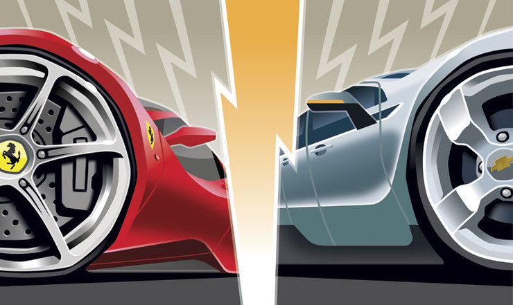
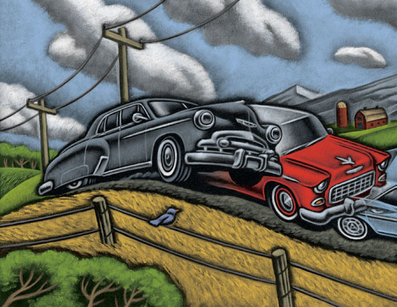
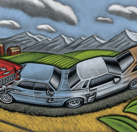
Another for Motor Trend about the release of two very different cars, the Ferrari 458, and Chevy Volt. The article describes the attributes of both. In my opinion the Ferrari ironically is more of going down the same trail. Expensive, fast, and flashy it's effect on the automotive world will be limited. Where as the aspirational implications of the Volt are much larger. Article was is titled, "Bolt & Volt". Art Director; Andy Foster.

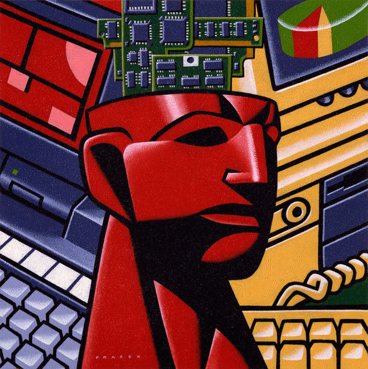
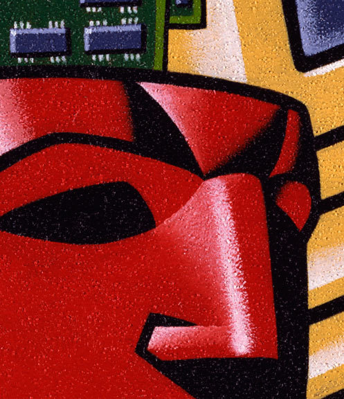
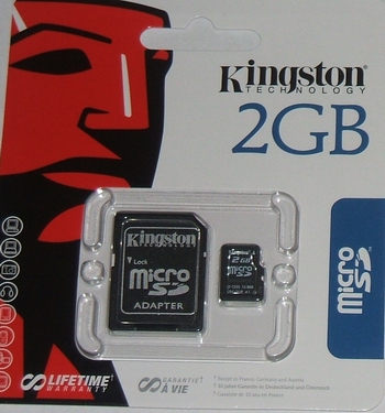
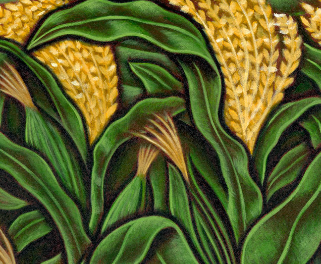
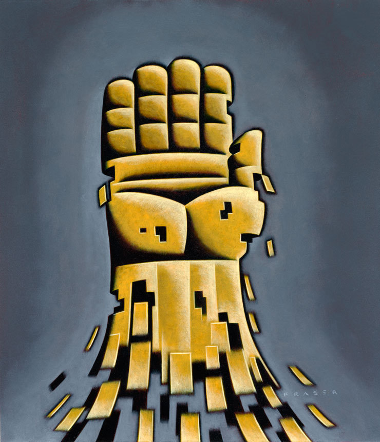
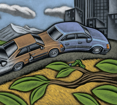
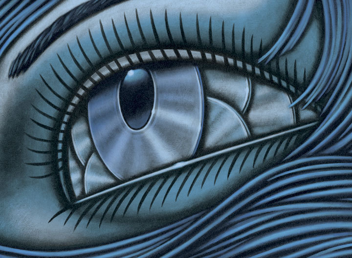
While in New York back in early November, I was honoured to be asked to be on one of the Society of Illustrators juries for the annual exhibitions of the best of the year. Sorry, I'm not about to post any inside info about the process of the judging. It was a small thing that Edel Rodriguez did as an aside. While taking a break I noticed Edel opening a number of small packages, one of which contained I believe was a memory stick for his camera. He looked at the package, smiled, and pointed the logo out to me. I saw a blast from the past. My first reaction was that of some self effacing humour, followed by recollection. After arriving back home out west, and about a month later, I was pulling apart the morning paper, when what slides out?… another sale flyer from a local electronics store. There is was again, and now that I'm a little more aware, it's been popping-up more lately. It was sometime back in the early nineties that I painted the original. The assignment was to illustrate a human head sans the top. There were to be computer chips going into the head. I developed a background treatment based on the imagery of the technology of the time. I painted in oils on a gel base on heavy stock paper. It was an odd approach as it made reproducing the art a real challenge. I remember the term, "specular highlights", and frustration. A transparency was usually a necessary step in reproduction. Having access to a good photographer was a must. The texture evolved out of an approach going back a decade.

Kingston - Early 90's - oils on heavy stock

gel textured base

updated logo application. kingston changed the brow, and vectorized it.

In the logo on packaging today the texture is gone, but there's that red head with no top. It's been in use for a while now.

Dog

DECEMBER 3, 2010

Dog is a noun, and can be a descriptor. Recently I did an illustration of a dog. It's a subject I've dealt with over the years. It's funny I've always had a picture in my mind's eye of the dog symbol. I'm not a big fan of small dogs, sorry Cesar. In my most recent dog themed assignment the art director, Jennifer Bumgardener was quite specific in her concept for the cover. Instead of chasing my tail, and her concept was fine with me. The issue is the December 2010 which covers the ninth-annual Industry Recognition Awards. So a magazine with the title of Pet Business, wanted a dog with a trophy. Oh yeah Jennifer asked for a coat on the pooch. Now it's not world politics, but people love their pets, and it's a cover. Covers can be a mixed honour, as area for type can really squeeze the art. The two sketches show a dog with a different attitude. Sketch number one was of a dog with an aloof presentation of the awarded trophy. Number two sketch is of a more triumphant K9. I actually liked the deadpan tone in number one, but the celebratory tone of number two was waved through. I've also attached several dogs from the past for some reference. Yes, I've painted a few dogs.


Vector art
New York Times - Sports - betting on underdogs. Brush & Ink. 2007

Warner Books Publishing - sometime back in 90's. Oils on canvas.

Financial Times - Dog Eat Dog. Oils on heavy stock. 1992

permalink | comment
Topical: Editorial  

Loz Angeleez

OCTOBER 20, 2010

The majority of my editorial work traditionally has been out of the maelstrom of New York. Then occasionally that laid back giant out on the fault line between reality, and narcissism, Los Angeles, notices my work. I've worked with Darrick Rainey at LA Weekly before, but this time it was with Jason Jones. Jason's personality, and approach are supportive, and pragmatic. The subject for the cover art is a timely one, as I've seen it in some of the current sports coverage. It's about the accumulative brain damage from playing football over many years. The story is about an individual who's life is utterly devastated by his years of playing football with great intensity, and ferocity. Jason had looked at my work online, and felt that my graphic brush work was his choice. The bold rough direct brush marks with ink on vellum added to a what is a simple graphic. I've usually felt that the elements of cover art should be large in scale, but I guess I feel that way about a lot of my work. Minutia has not be apart of my favourite covers, but there's always exceptions to any rule. A special thank you to Paul Rogers for entering out on to the harsh streets of Pasadena for a gritty street photo.

About a week passed, when Wes Bausmith an art director emailed from The Los Angeles Times. He'd seen the LA Weekly cover, and was offering an assignment for Sunday Op-ed page. I was happy that he enjoyed the cover, and we got going on a new assignment. The subject was from two accompanying articles about the Los Angeles county probationary system, and youth. One article was from that of a man, who as youth had gone through the system. The other was that of an a civil rights attorney in Los Angeles who outlines the ineffectual nature of the probation system. After reading both articles I felt the failure of the probation system lay in the indifference of the System/Guards. The second article also pointed out the  recogonition that there was a connection of the dysfunctional guards to the youths who are charged to them. The youth offender/prisoner is shackled to an indifferent system.


Well, as the gaze from the smog filled eyes of the City of Angels shifts, hope springs eternal.

Oklahoma

SEPTEMBER 26, 2010
Oils on Strathmore

Must be the season as I'm seeing another Oklahoma poster. I worked on one as well back in March. It was for the Arena Stage in Washington, DC advertising this fall's production of Oklahoma. The assignment was with SpotCo in New York. I know another Drawger who has done quite a bit of great work for the Arena Stage is Jody Hewgill, plus Paul Rogers has also done great looking work with SpotCo. It was interesting for me because, Nicky Lindeman, the art director chose my more traditional/older approach of working. That is my older work using a more traditional painting approach in oils. My first assignments when starting out in my career were all oils(oils with an alkyd based drier) on strathmore. It's not very often these days I illustrate entirely in oils. Most assignments for me are digital based, or with brush work scanned in for development. Nicky asked for a regionalist flavour, and a lot of area for type. The emphasis for the art was the land, and a somewhat grittier tone from the traditional Oklahoma imagery. The Arena Stage production of Oklahoma opens October 22nd, through to December 26th in DC.

Detail.1

Detail.2

permalink | comment
Topical: Advertising  

Hands Up

SEPTEMBER 15, 2010
for The Wall Street Journal

Over the last few years the symbolism of a hand has stood in for that of a figure in my work. In quite a few of my recent assignments the need to indicate an individual can be fraught with questions of nationality, race, and others. For many years I developed a figure with a generic structure purposefully. There was, and have been questions when I worked of making sure that the figure was not too "scary". Use of shadows, and usually requested powerful figures made some clients uncomfortable even though it was that very quality that had them calling on me. After working through many sketches, the simplicity of the hand as a representation of a group with the fingers, or just a lone individual, and many of the nagging questions went away. I do enjoy working with the figure still, but … well in many cases it's ended up being a hand. This last week it was a hand for the Wall Street Journal. An article on investing in power & utilities, and the editors wanted POWER. It was the art director, Orlie Kraus who called. Hell we even talked on the phone! Not just email, and text. Well Orlie & I worked hard to offer the editors(word people) solid choices. The first round of my sketches were sent, and well so it went. The Hand was the editor's pick. Next was the request for "Show Me The Money", dollar sign, and dollars added. With the second round, Orlie tried to offer our favourite of the utility towers for reconsideration. Nope, it was POWER that was wanted, and the hand was waved through. I went at the hand to make it as powerful as requested!

First round sketches.

Second round sketches.

Another recently published hand based illustration done for the National Federation of Labor. Subject; Organize The Unorganized!

permalink | comment
Topical: Editorial  

Prius & Porsche

AUGUST 23, 2010

Couple of recent assignments were car related. First one was a cover for an international edition of Newsweek. The title was the Flying Prius about the never ending dream of the flying wing. It's the pursuit to bring the energy efficient qualities of the flying wing shape to the mainstream commercial aviation industry. Creating a version of the Prius for the airline industry. Art Director; Adolfo Valle.


Final direction

Close-up

The next one was for Motor Trend. Its a regular column with a roving subject. This month's about the enjoyment and build of a classic Porsche replica. These newly built replicas are mechanically superior to the original,  while retaining the original classic lines, and interior look. Allowing the owner peace of mind of not putting an original in harm's way while driving in the real world. Personally I'd still be sweating as these high quality replicas are not cheap either. Title for the column was; Auto Avatar, the bathtub Porsche reimagined in Cameron-grade HD/3D/CGI brilliance. Art Director; Andy Foster.

Yes, that's a Navi at the wheel.

permalink | comment
Topical: Editorial  

Roxy

AUGUST 9, 2010

Finished another personal piece. The painting is of an old local movie theatre from the back. The name of the theatre is the Roxy. It's fate is up in the air these days. It's an independently short run venue that charges a percentage of what the bigger chains do. It may be streaming video, or death by blue ray for the Roxy. Title for the piece is, Roxy's Back.

Base pencil - canvas size - 18 by 40 inches.

Process - painting in oils. Usually have to do a minimum of two coats per colour to get the opacity I want.

Finish

Detail

Signed on the side.

Roxy's Back - oils on canvas - 18 by 40 inches

Piercing

AUGUST 2, 2010

Illustration for Research News 2010 summer issue. The idea for this illustration was to simply indicate the piercing of a cell membrane. In an article about taking apart an infectious disease, the subject of Dr. Stefan Pukatzki, who has uncovered a new method that bacteria use to cause disease. The art director for this assignment was Lara Minja, of Lime Design inc. Lara, and I aimed for a simple graphic. I worked in a vector based approach as it lent itself to a clean image with rich colours. The precision of piercing a cell, and injecting material is the work of a labratory, and medical research. I enjoyed the opportunity to explore a somewhat abstracted way of designing the image in my sketches. There is space in the upper area for type as well. I enjoyed working with Lara.

Pencil Sketches

permalink | comment
Topical: Editorial  

Muscle & Shadow

JULY 21, 2010

Couple strong guys for recent assignments. A full page image about labor costs for Convene magazine. The next one is for National Geographic online, and about reducing energy use, that's belt tightening. Another one for Motor Trend, well it's shadowy, and about an American "muscle" car. The Mustang, the original pony car becomes a thoroughbred.


permalink | comment
Topical: Editorial  

World Cup

JUNE 7, 2010

Well it's been awhile since I've done a TIME cover. D.W. Pine emailed asking if I was available over the Memorial Day weekend. No one phones anymore, and maybe D.W. needed someone who wasn't going anywhere for the weekend, Ha! He thought a very strong graphic, poster-type cover with a player and ball would be cool in my style. Very straight forward, and to the point. Fine with me, as I enjoy the opportunity to really explore a object in it's structure. One of the bigger choices for me was whether to portray the traditional black & white soccer ball. I went with a more contemporary looking ball as it describes more appropriately the feeling to the event held in South Africa. As with any current cover work, there is the need for providing space for the necessary text, and masthead while maintaining the energy. Originally the text was to be on the left, but after an Editor review it was now on the right.  The Editor wanted a single player making a kick from the back, as I had done with another sports image of a baseball player. Not highlighting any one player was the goal.

First round of sketches with text in the lower left.

Text moved to the right. The energy was not going in the 4th sketch. I sent D.W. another even before he responded to #4.

Base drawing for paint. The number 19 is for the 19th World Cup. On to finish, and back to the top.

permalink | comment
Topical: Editorial  

Cargo

JUNE 1, 2010

Roy Comiskey coined a great description about the last assignment we did. It's in the June issue of Security Management magazine. After seeing some of my gallery pieces, Roy thought my approach would be great for the cargo security topic of an upcoming article. Roy has been one of the most open Art Directors I've worked with. He's allowed me the space to explore my approach in many different ways over the years. Being one of the first A.D.'s to embrace my digital work back in the mid 90's. He described some of my newer pieces as Pop-Realism. I quite liked the term. It's a vector based approach, done in Adobe Illustrator. In my gallery work, I usual work up the color, and structure in a vector based study for the final paint. The gallery work is done in oils, but for publishing purposes the digital works best.

permalink | comment
Topical: Editorial  

Utility

MAY 24, 2010
Utility - oils on hardboard 12 x 24 inches

My neighbour across the street has an old homebuilt utility trailer. It's used to carry old furniture, soil, building supplies, and any other thankless tasks. It follows an old Ford, and it reminds me of one my Father had. Although my Father's was a weathered box off an old Studebaker truck. The main frame of this trailer is from an old truck too. The sides are angle iron, and 3/4" plywood. All the metal is painted black, but it's the custom plexiglass fenders that give this trailer it's own look. The plexiglass is old, & cloudy, probably quite brittle now. Still there's no cracks in them. Oh, yeah that spare tire is probably quite old too! The battle ship grey paint job seems to have been refreshed recently. When it's parked across the lane, it just makes me smile, as it sits under the dappled light of the oak trees. I suppose this image is more nostalgia in tone than I first intended when started.

3 East

APRIL 26, 2010
Oils on canvas - 20x40 inches

3 East is the name of my latest gallery painting. In my gallery work, I've been trying to deconstruct the subject matter from my own personal engagement. As an illustrator, I'm asked to interpret other's thoughts. Also a stepping out of my heavy use of line in my illustrations. Line is a construction of the mind to explain something in a subjective manner. Our brains are doing the "seeing", not our eyes. The eyes when allowed to see with a purity that quite often is forgotten as we age. In seeing the shapes of what I'm looking at, it's been an exercise to put down my visual prejudices, and just look for a time. In closing, a book I read years ago now, had a title that has stuck with me. The title is "Transfiguration of the Commonplace". Yes, also I very much enjoy working with line, but I'm exploring elsewhere lately.

Early sketch
Detail.1 - edge
Detail.2 - edge

Slow Ride

APRIL 12, 2010

This month's Cycle Canada has an article that rings so true for me. Yes, it's my illustration that accompanies the article, and I'm honored. I was asked by Neil Graham, the editor, to contribute to another finely written article by Ted Bishop. Ted's done some award winning writing. The idea being put forth; Tempo Giusto: In Praise of the Slow Ride. I worked with the very talented, Chris Knowles. He's the art director that keep's up-righting the magazine when it's visually gone off.

An excerpt of the article gives the feel;

Coming out of the concert hall up on the mountain in Banff, where young musicians had been performing Beethoven’s 7th, I thought – Maybe a long ride should be like a symphony. If it’s all allegro it becomes like those crazy bluegrass sessions where the picking starts fast and just gets faster. An andante movement defines the fast; you feel how much pleasure can be wrung from a single note, a single turn. At the end both movements resonate within you. I presented this theory to my partner Hsing, a classical musician, thinking she’d be impressed. She said, “This is just an excuse to buy another motorcycle. I know you.” I feigned aggrieved innocence. Did she know that before the concert I’d heard the throb of an old Guzzi Eldorado coming up the hill? I dropped the topic, but this winter I’m going to be scanning the classifieds for an old thumper, a mile-muncher, not a road-burner. There’s a new breed of rebel out there, and they’re riding any damn speed they like. I’m going to tattoo “Born to Burble” across my chest and join them.

Ted Bishop.

Early sketches for one pagers.
Sketch for possible spread.
Final art
permalink | comment
Topical: Editorial  

100 Heads for Haiti

APRIL 5, 2010

One more post for the show & sale of - 100 Heads for Haiti

Once again, my contribution to the Haiti benefit show "100 Heads for Haiti" that Dave Plunkert at SPUR Design has organized to benefit Doctors Without Borders
GOAL: $10,000
Original Art and a Group Poster print will be sold at the gallery, pieces will be sold on a first come, first serve basis. The remaining pieces & posters that do not sell at the gallery event will be available for purchase online for one month after the opening.
Original Art: $100 (plus tax) Two piece maximum per customer.
Group Poster: $50 (plus tax)

permalink | comment
Topical: Other  

Working

MARCH 31, 2010

Tomorrow's April 1st, well although another month away is May 1st. One of recent assignments was on the history of May Day, the international day for the recogonition of the workers of the world. The article I illustrated was about International Worker’s Day and Canada’s contribution. "While May 1st, International Workers’ Day, is commemorated as Labour Day in most countries around the world, in Canada and the United States, Labour Day is the workers’ holiday celebrated at the beginning of September. Both, however, celebrate the achievements of the labour movement in securing workers’ rights". Well Sisters, and Brothers, here's wishing you well on March 31st.
• On a very happy secondary note, I've followed Richard Down's example, and moved my home website. After tens years my site was getting old and clunky. Mr. Zimm dialed the performance back up. I'm happy to have my website resources connected & working together now.

http://www.fraserart.com

Full spread
Detail.1
Detail.2
permalink | comment
Topical: Editorial  

Sedan

MARCH 5, 2010

As a follow-up to a previous assignment from Motor Trend magazine, about an evolutionary process, I was asked to do another one about the popular sedan. From a '49 Chev, '55 Chev, '66 Impala(Chev), '76 Cutlass(Olds), '82 Escort(Ford), to a '89 Taurus(Ford). The art director Andy Foster thought keeping the feel of the previous evo illustration was the way to go. It's kind of like playing with little metal cars as when I was a kid. Definite nostalgia. Well it's in the March issue, on newsstands now.

1/3 of spread art
2/3 of spread art
3/3 of spread art
Full spread
Previous spread on the evolution of the diesel.
permalink | comment
Topical: Editorial  

Golden Pump

FEBRUARY 24, 2010

Had a holiday break for a spell in late January. After that in February I've been working on several charity based projects lately. Still one to go, and a couple of illustration assignments. The one I'm posting is for the St Louis AIGA chapter, and the American Heart Association. The Heart, one of those two special organs. I leave the second to your choice. I've painted the heart a couple of times before, and wanted to try push another direction. This painting is oils on wooden panel, with gold leaf on the sides/edges. The heart is supposedly the seat of love, maybe it's the love of life. Hope yours keeps pumping.

My pencil sketch for my new heart.
The Golden Pump - Oils on wooden panel.
Gold leaf on the sides.

BizWeek After Bloomberg?

JANUARY 1, 2010

In December I worked with Don Besom at BusinessWeek . It was interesting talking with Don, now that the magazine is owned by Bloomberg it remains to be seen what's next. There was a sense of melancholy recalling all the people I met while working on BusinessWeek assignments. I can remember walking into the McGraw Hill building to drop off my portfolio back in 1985. I've contributed illustrations on & off over the years. The latest was a book review on the subject of the contemporary CEO as seen by a couple of French academics. The book title is; From Predator to Icons.

 Also below is the very first assignment I ever did for BusinessWeek. It was about the farming crisis in the midwest. The Art Director was Sharon Bystrek. Well, farming is not creating the same headlines these days. It's forward into 2010.

riffing Picasso
oils on heavy paper stock

• Below is the thumb sketch I did for my first ever BusinessWeek assignment in 1985.

Final art - oils on strathmore paper
Cover art sketch on Third World debt around early '87.
Final art - oils on strathmore paper
This was a special issue. I also did all the open art for each section, about five other illustrations. All the art was painted in the last month of '85. Art Director; Malcolm Frouman
One of the interior pieces. That computer was high tech.
Another interior from the Industry Outlook issue.
Mr. Gorbachev came for a visit.
permalink | comment
Topical: Editorial